Web Design Trends Beginning of 2017
 We’re officially halfway through 2017 and you might have noticed a few web design changes on your favorite sites. Some design elements are more subtle, while others are bolder. Design is constantly evolving, meeting the needs of readers/consumers, so make sure you remain current and user friendly. Here are the 2017 trends we’ve noticed thus far:
- Content at the heart of design: This should be obvious, but there is a greater trend towards designing for the user- understanding the demographics, trends while on the site, etc- an incorporating this knowledge into the design flow.
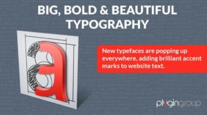
- Bold type: This doesn’t necessarily mean bold typeface, but rather, a short description or statement that is awarded its own area to make a bold statement.
- Richer backgrounds and patterns: Think bright colors, geometric patterns, and moodier aesthetics. These colors and designs make a statement on their own and are a contrast to the simple design previously dominating the landscape.
- Contrasting typefaces: Typefaces don’t need to have a flow, instead, they need to have a stark contrast. Again, this makes a statement just by being different.
- Animation: Visual tools hone in users and make the design more engaging. Watch for new tools to make animation more prominent, streamlined, and unique. This is not only visual, but also stimulating and educational.

Leave a Reply
Want to join the discussion?Feel free to contribute!